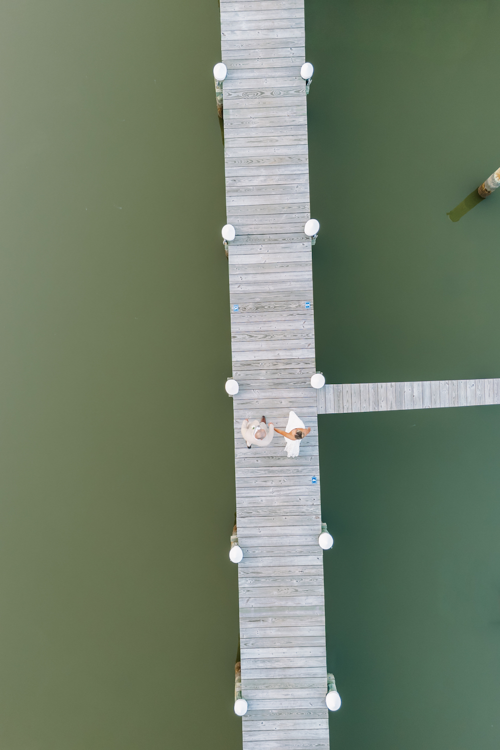
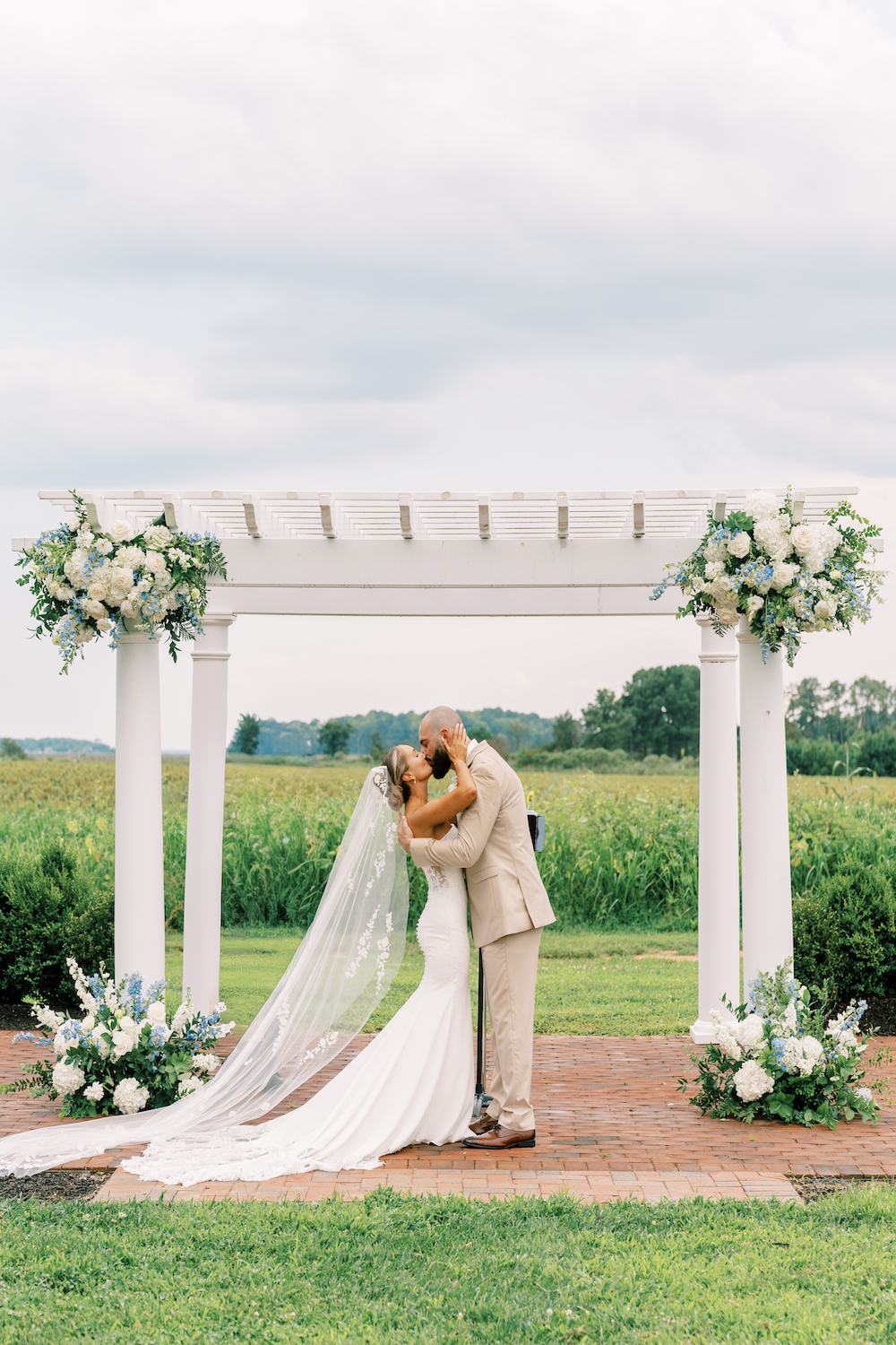
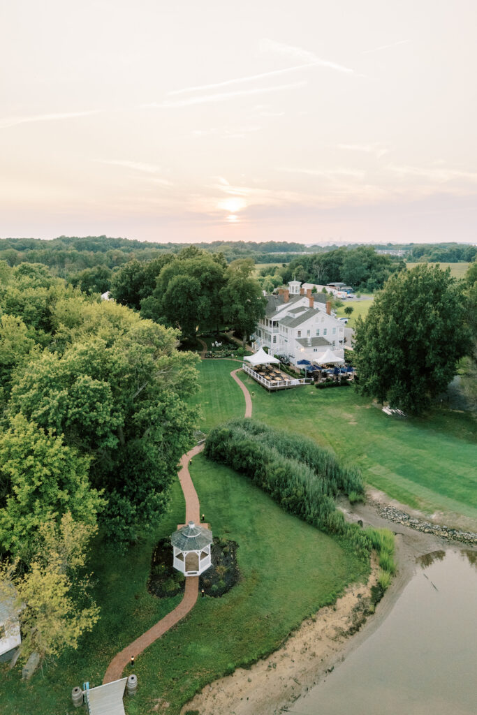
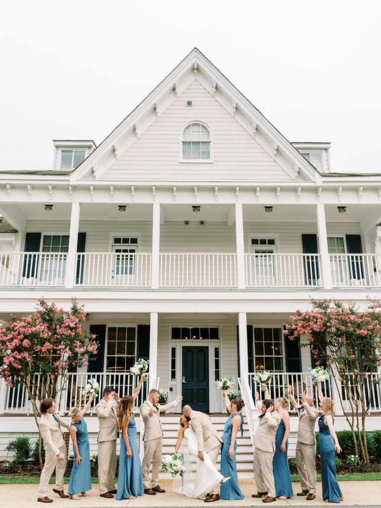
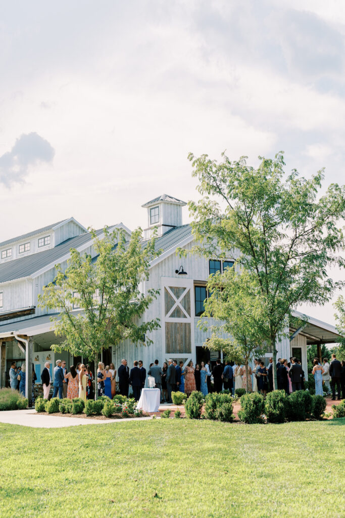
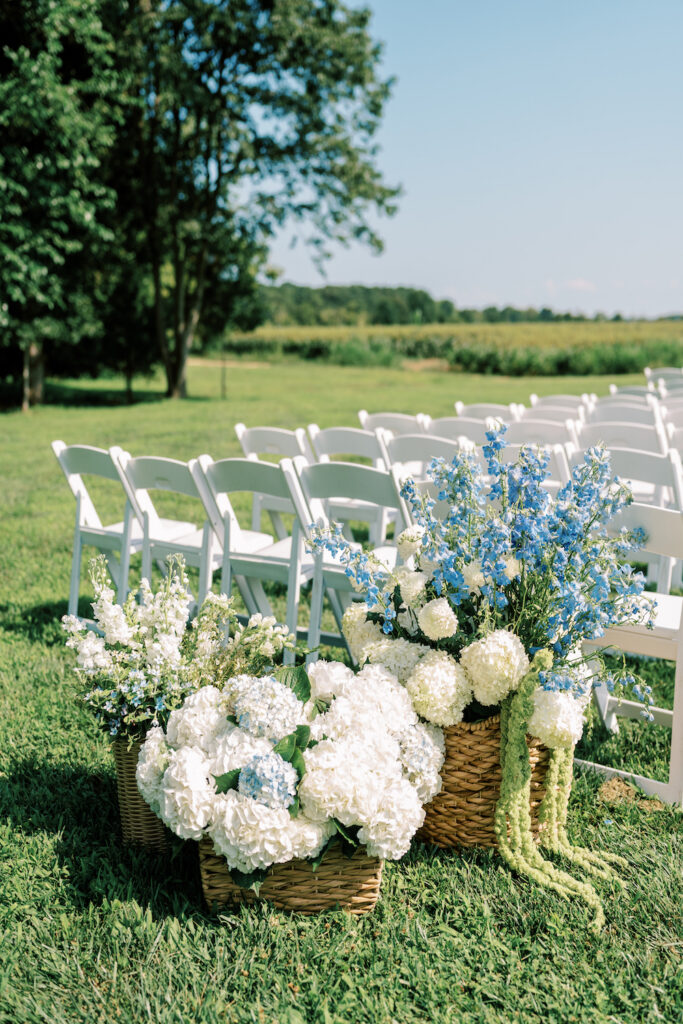
Kent Island Resort has a way of making you feel like you’re somewhere far away from your everyday life: water on every side, that particular East Coast summer light, the kind of venue that sets a mood before a single detail is placed. For Jake + Lexi, it was the perfect backdrop for a wedding that committed fully to its coastal identity.
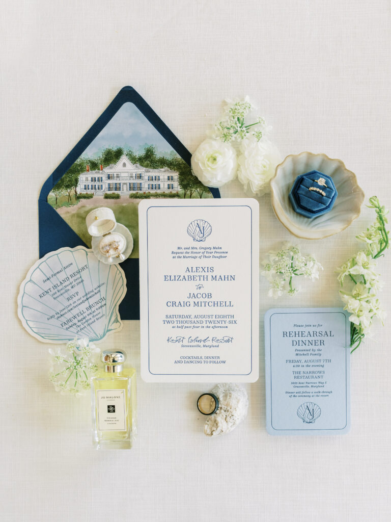
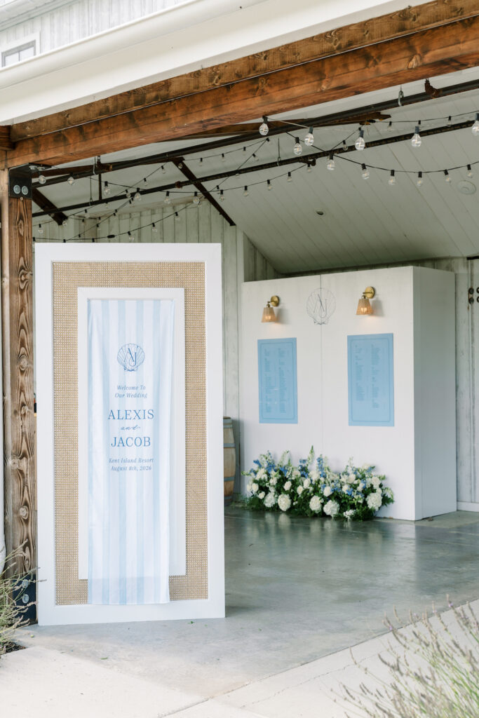
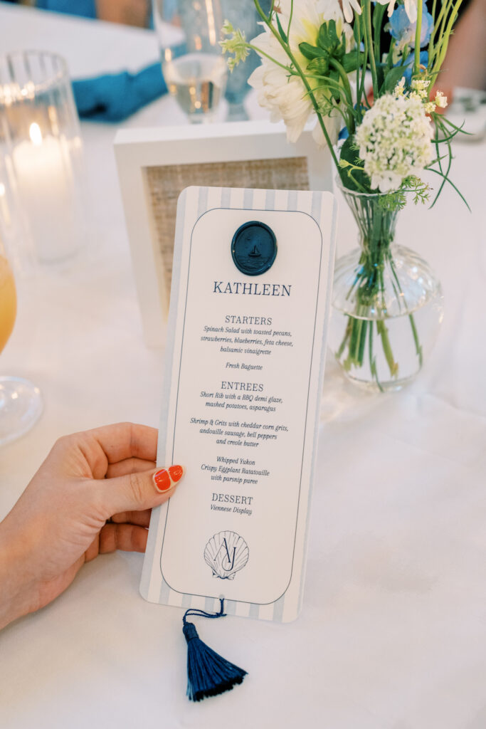
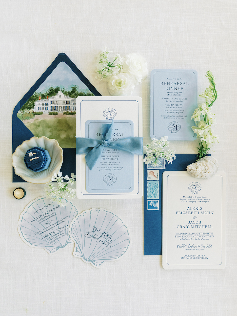
The design started with a custom shell monogram, a scalloped crest with their initials that became the throughline of the entire day. It showed up first in the invitation suite, anchoring a navy and sky blue palette that felt crisp and intentional without being overdone. The watercolor venue sketch tucked into the envelope liner was one of those details that guests pull out before they even read the wording: a hand-painted illustration of the resort that set the tone for everything to follow.
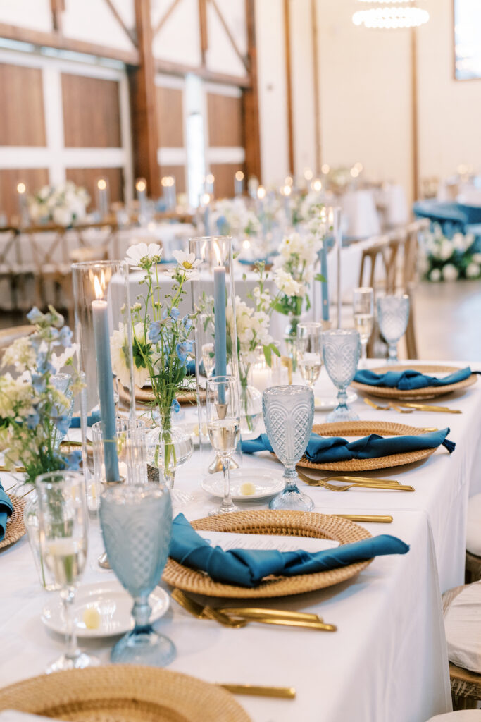
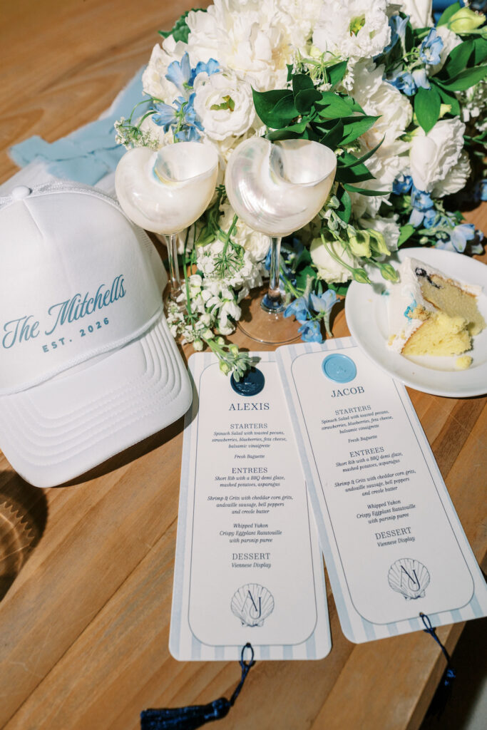
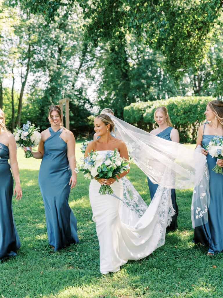
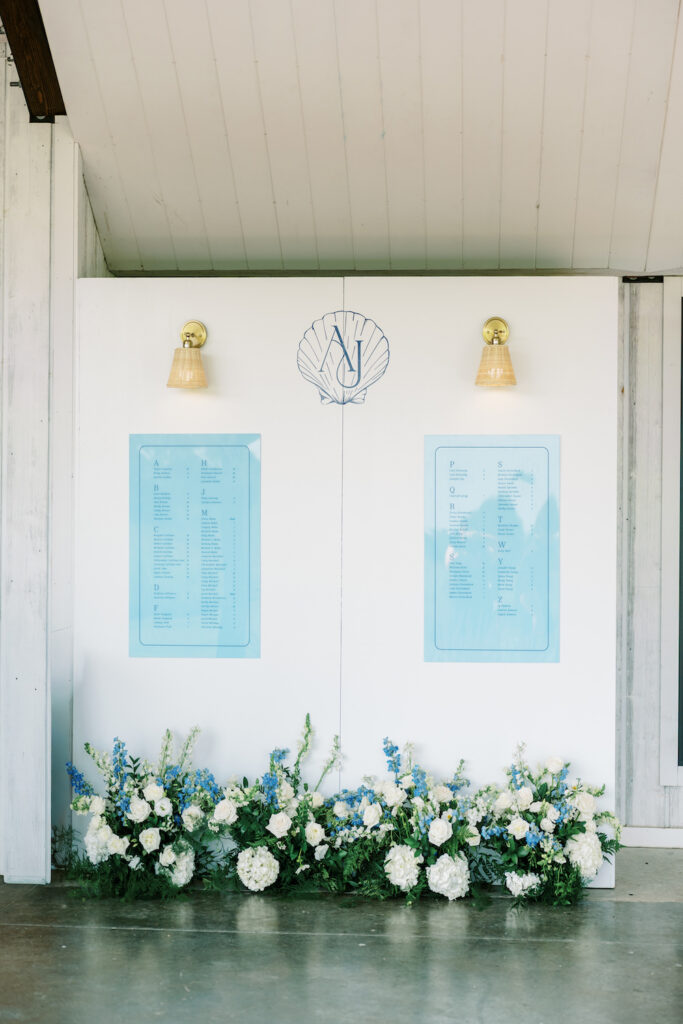
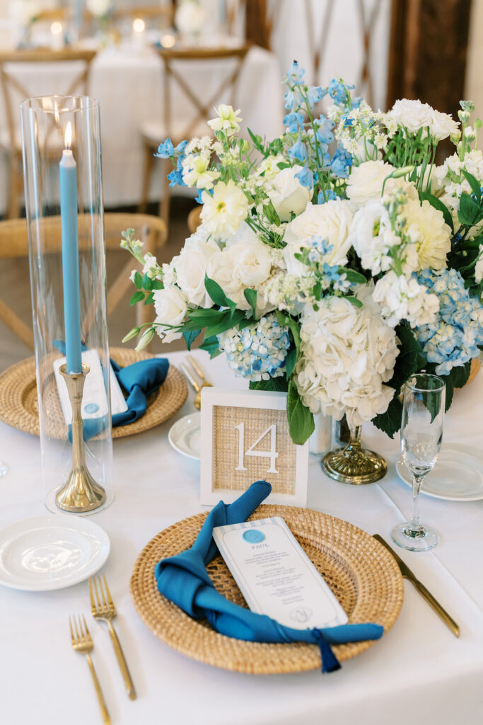
That monogram didn’t stop at the invitation. It carried through the blue seating chart, the striped menus with their navy tassels, and into the smaller moments—like the matchboxes that guests actually took home and used. When a design element travels that far through a wedding day, it stops being stationery and starts being a brand. That’s exactly what this was.
Vendor Team:
Venue: @kent_island_resort
Planner: @ludicevents
Photography: @ericalynn.photo
Florals: @eighttreestreetfloral
Beauty: @updosforidos
Rentals: @prettylittleweddingco
DJ: @washingtontalent
Cake: @bluecrabcupcakes
Invitations & Signage: @lifein.letters
Leave a Reply